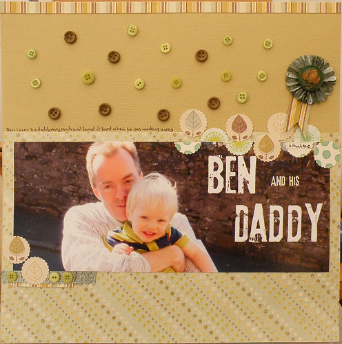
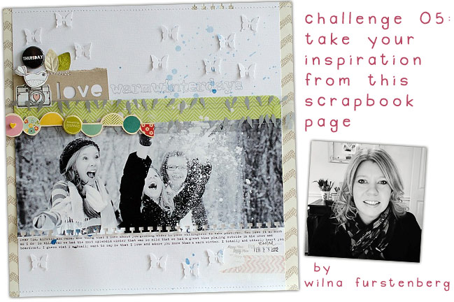
I love the idea of a panaramic photo but the first thing that caught my eye was the line of circles and half circles. Looking closer at the page I noticed the scattered butterflies so used the scattering idea on my page but with buttons
Having a large area of wall in the photo seemed a good place to add the title so did that on the computer before printing the photo. I used 3rd Man font

I'll be back later with how my day has gone.


4 comments:
Ooooh this is stunning Mary - I do love what you did with the title, the dotted around buttons are fun too and I adore the leafy border.
What a gorgeous photo that is! and a really lovely page. I find everything Wilna does so inspiring
Oh Mary, this is a really great page! Buttons, of course - but it is just lovely! I like what you did with the photo - the title and the cropping, to place the main focus on the left side.
The original page was very nice - but I think your own version is just stunning!
This is so adorable. Love the colors and the buttons. Great photo!
Post a Comment